Lots of fantastic people already put their hands on building a responsive navigation, and they came up with sweet ideas, like this Tutorial on .net by Aaron Gustafson.
And there is also a neat overview about “all” responsive navigation patterns by Brad Frost where he points out the cons and pros in a detailed way.
However most of these patterns are not really applicably when dealing with “large” navigations or multi-level navigations and thus I tried to develop one which also doesn’t need JavaScript.
If you are wondering, the navigation structure is the one used on a german newspaper, as I wanted to test it with a real world example.
Before finally diving into my example, I have to admit that I am still searching for a “perfect” solution, as each of the following has some drawbacks, you may see as a deal breaker in your project.
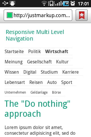
The “I don’t care” or “Do nothing” pattern #
Let’s start with the simplest pattern you can imagine, which is in other words doing nothing. Surprisingly there are also some advantages, especially that it works in nearly every browser.
Advantages #
- The top level navigation is accessible with one click/tap for almost every browser
- It doesn’t depend on JavaScript
Disadvantges #
- Sub-Navigation is only accessible at once by non-touch devices, but as we show the current Sub-Navigation for all browsers, you can reach the sub navigation with two clicks on touch devices as well.
- Especially on small screens lots of space is “wasted”
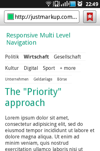
The “Priority” pattern #
Next I want to show you the “Priority” pattern, which tries to reduce the wasted space, but is nevertheless still not able to give “everybody” direct access to sub level elements.
These technique basically has the same advantages and disadvantages as the previous one, but comes with the great benefit not wasting that much space.
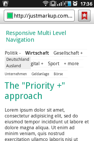
The “Priority +” pattern #
Going one step further I tried to improve the previous example by making the Sub-Navigation also available with one click/tap, but came to the conclusion that it’s not really possible by just using CSS. If you expand the top navigation to all elements and try to access the Sub-Navigation via [+] all the “less-prio” list-items will be hidden again. You may can avoid it by using some fake elements and the nth-child() selector but I didn’t really want to go that nasty.
Conclusion #
As already mentioned in the beginning I couldn’t really find the clever solution, but I personally would use the “Priority” pattern as it’s a clean way with great browser support, although you get to see the Sub-Navigation only after taping twice on touch devices. The “Priority +” pattern somehow solves the “double tap problem”, but is on the other hand irritating and not really user friendly.
That said, I would in the end use some JavaScript to imitate the :hover Effect for touch devices, as it’s, as far as I can see, the only way to make that work in a clean way.


