I am currently redesigning my website and therefore also the navigation. There are loads of different navigation pattern and I made many myself in the last years. However, I searched for a different solution again as none of the patterns I know offers the following points I had in mind:
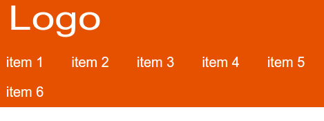
- It should work well without JavaScript.
- On small screens, all menu items should be easily reachable
- Important menu items should always stay in the beginning
1) Should work without JavaScript #
This is simple to achieve, I used the Cut the Mustard technique to only serve JavaScript to modern browsers and then add class=”js” to the html element to be able to style the menu differently. I also add EventListener to open/close the menu.
Here is the complete JavaScript:
(function (doc) {
	// CTM, only init JavaScript for modern browsers
	if ('visibilityState' in doc) {

		// Add class to html elment once js is available
		doc.documentElement.className = 'js';

		// Add Eventlistener to open/close menu
		var menuLayer = doc.getElementById('is--menu-layer'),
			menuClose = doc.getElementById('is--menu-close'),
			menuOpen = doc.getElementById('is--menu-open');

		function openMenu () {
			menuLayer.className = 'is--menu-opened';
		}

		function closeMenu () {
			menuLayer.className = '';
		}

		menuClose.addEventListener("click", closeMenu, false);
		menuOpen.addEventListener("click", openMenu, false);
	}
}(document));
On older browsers and devices without JavaScript the menu items will always stay visible and will align to the left.
2) All menu items should be easily reachable #
Smartphones are getting bigger and bigger and thus it becomes quite hard to reach menu items in the upper-left corner. Thus, I made an wrapper around the menu list and set it to position: fixed (yes, this is dangerous on some devices but with the CTM technique above this only applies to browsers where support is good enough). Next, I set the menu list to position: absolute and position it down in the right corner. This way all the items are reachable quite easily with one thumb.
3) Important menu items should always stay in the beginning #
While all the items are now aligned at the bottom, the most important items (usually first in order) are still at the top. To change it, I used this technique to reverse the order of the items and, therefore, show the most important item at the very bottom.
.js .navigation ul {
-webkit-transform: rotate(180deg);
-ms-transform: rotate(180deg);
transform: rotate(180deg);
}
.js .navigation li{
-webkit-transform: rotate(-180deg);
-ms-transform: rotate(-180deg);
transform: rotate(-180deg);
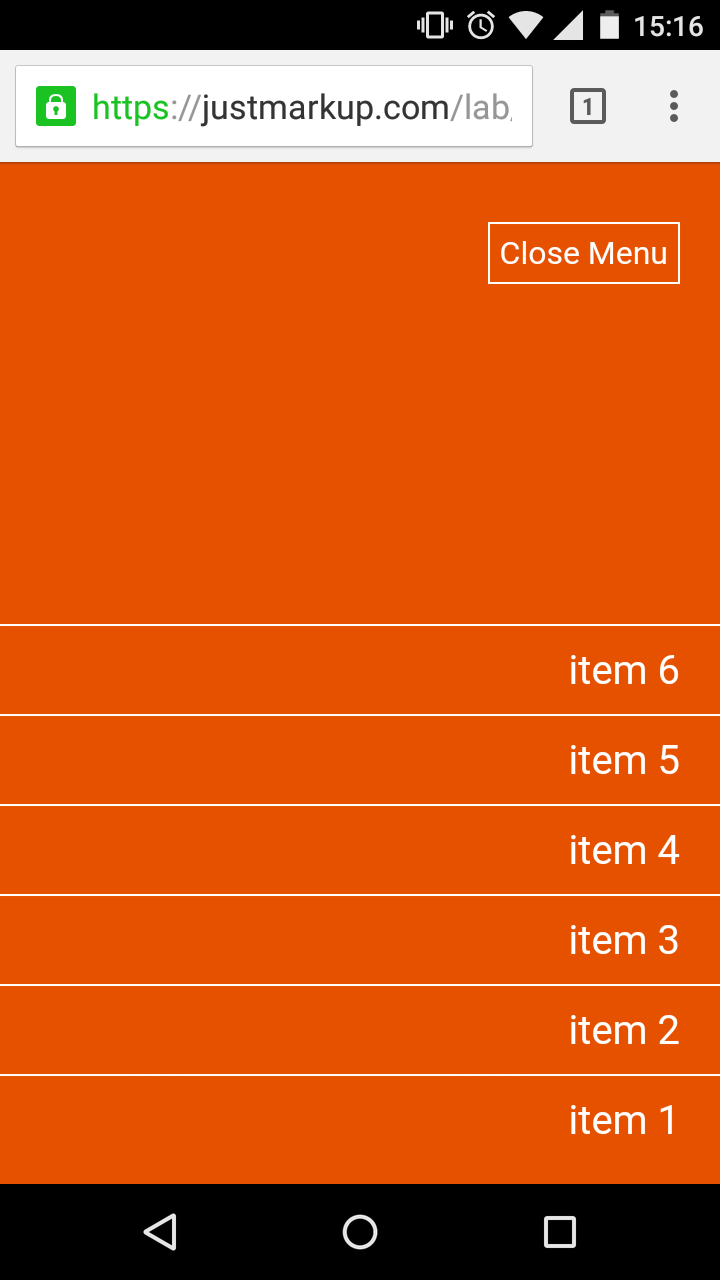
}Here is a screenshot of the opened menu on Android:
Code #
Here is the demo and you can find all the demo files on Github.
If you find any bug please open an issue on Github.